Style
How to beautifully and correctly combine colors in an image?
If you have ever heard the phrases: "BLUE CANNOT be combined with beige!" - this article is for you. Such stereotypes limit us in expressing ourselves through style. In the modern world of fashion, everything is simpler and freer. There are no ingrained strict rules for the "correct" color combination. Only your preferences, the desired impression and a few universal schemes, which we will talk about below.
You can build on the techniques below and make your own adjustments. Or you can be inspired by them and give free rein to creativity! Or use them as a cheat sheet.
First, let's take a look at the main categories we'll be using.
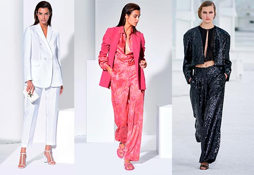
The first group is the achromatic colors. These are the names of black, white and gray. Their peculiarity is that they are combined with any shades and with each other. Gray goes well with both white and orange, for example.

The second group is muted shades. These are all colors that have a gray pigment. For example, not bright yellow, not neon - namely, soft shades of yellow.

And the third group is bright colors. You can also call them "clean". These are color shades without a touch of gray.

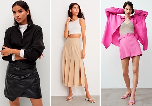
The first thing we need to remember about the combination of colors - achromats and muted shades are combined both with each other and with any bright colors. For example, beige pants go with everything!


The second universal rule that will help you look stylish and appropriate in any bright looks is the rule of balance. We always try to maintain a balance either in terms of color saturation or their temperature.
How can this be applied in practice? Very simple! When creating an image, try to choose colors that are close in saturation: combine bright with bright, and muted - with muted. Yes, in this case, you can combine cold shades with warm ones. The main thing is the same saturation!

And if you want to combine bright colors with muted ones, then I recommend keeping a balance in temperature: combine warm shades with warm ones, cold ones with cold ones.

Now let's talk about universal schemes for combining bright colors. To do this, we need to know a few tricks with which the color wheel will help.
1. Monochrome combination. Surely you've heard of monochrome looks? For several years now, this technique has been a fashionable trend. An image in one color always looks interesting and, moreover, visually stretches the figure. In this scheme, we combine colors in one color sector - for example, we select the entire image in different shades of green: from darker to lighter.


2. Combination of two opposite colors in a circle. This scheme is called complementary and is popular not only in the fashion world, but also in interior, product design and other areas. What is this technique: we take one color from the color wheel, for example, yellow, and find the color on the exactly opposite side to it. In the case of yellow, it is purple.


3. Contrast color + one step left or right... If you are close to the theme of bright images, but you do not want to play too defiantly on contrasts, this color scheme is for you.
- Step 1: choose one color and the color opposite it. For example, yellow and its contrast is purple.
- Step 2: from purple we move one sector in any direction (left or right). And we get two harmonious combinations: 1) yellow and blue, 2) yellow and red-violet.


4. Two adjacent colors. For example, blue and cyan, orange and red. This combination of vibrant colors helps to create an eye-catching but not flashy look.


5. Triangle. This color technique helps us achieve a rich combination of three shades.Choose three colors at equal distances to make an isosceles triangle. For example, light green, pink, blue.


6. Three adjacent colors. A harmonious combination of three close to each other shades in the color wheel. For example, red, pink, purple.


7. Combination in a square. In this technique, we create an image of four colors, where one or two colors are primary, and the other two are complementary (can be used in detail). Using this scheme is easier than it sounds: each of the four colors is two sectors away from the previous one. For example, green, yellow-orange, red, and blue-violet.


Try combinations that are interesting and unusual for you, experiment and express your personality through style. Then any of your looks will become harmonious and eye-catching!
Tell friends:
Comments and Reviews
Add a comment
Similar materials
 The best color combinations in clothes for men
 Bright colorful wardrobe: there are no rules, but there are recommendations
 Ideal color and shade combinations for men
 How to find the best clothing color combinations
 The best black and white looks and prints from fashion collections
 How to choose tights for clothes and shoes: tips from a stylist
Rating news
Shades of clothing that make women look younger
What shades of hair make women younger: rules and photos
Funny wedding dresses - photos and ideas
12 most expensive down jackets for the winter
How to look 25 at 40: tips from supermodels
Beautiful schoolgirls
Anti-aging haircuts and hairstyles for women
Fashionable skirts for autumn and winter
Fashionable women's trousers for the cold season
Fashionable and stylish sandals for summer 2020
Spring-summer 2021
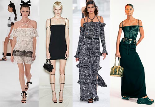 Fashionable dresses and tops with thin spaghetti straps
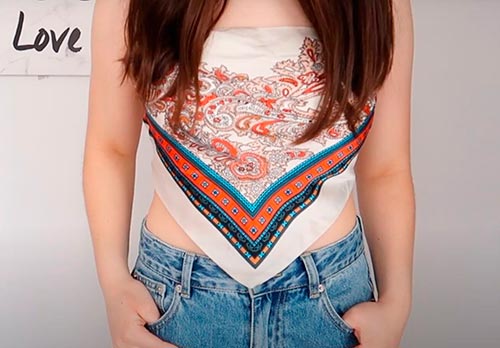 Bandana tops: how to wear stylishly and beautifully
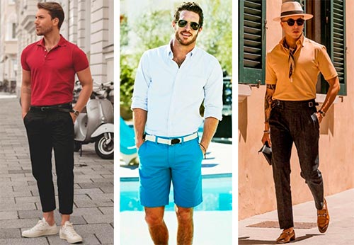 How to put together the perfect men's wardrobe for the summer
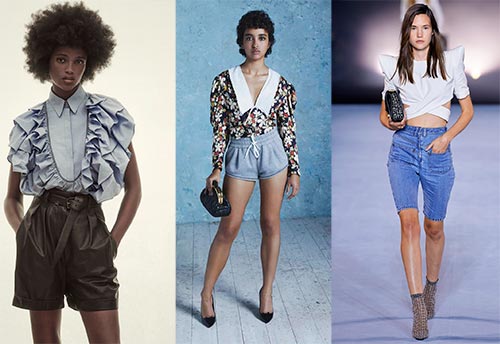 Fashionable shorts for spring-summer 2021
 Fashionable skirts for spring-summer 2021: a guide to online shopping
 The most fashionable dresses spring-summer 2021: styles and colors
 Fashionable total look 2021: ideas of images and trends