Style
How to correctly and confidently combine colors in clothes
Since childhood, in fine arts lessons, we get to know color, learn its characteristics, mix colors with each other, and this is a very exciting process. But growing up, more and more stereotypes associated with color appear, and as a result, there are many restrictions. For example, rumors that black should never be worn with brown or blue, or beige with white. And so every time we are less willing to take risks, and even when we want to buy some bright thing, out of habit we give preference to the same colors that we already have, staying in our comfort zone. If this is familiar to you, then it's time to deal with all sorts of restrictions and switch from color to you!
Therefore, for everyone who wants to add color to their wardrobe, I want to offer some simple and win-win schemes with which you will stylishly compose bright images, and they will not go unnoticed.
But first, to make it easier to deal with color in general, let's figure out what colors are. Let's divide them into three groups:
Achromats, Neutral and Bright.
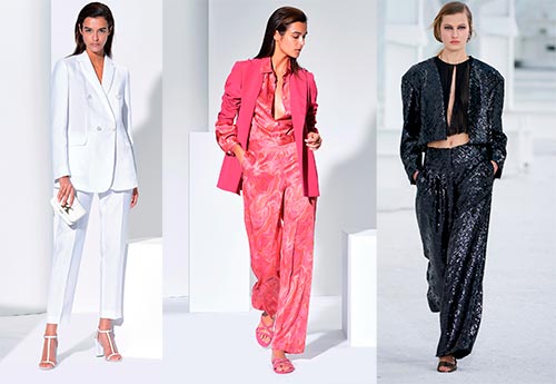
Achromatic or colorless colors include white, black and gray. They go well with each other and with all other colors. In this combination, we can easily use the stylistic technique "Accentuation", introducing one color accent into the achromatic image, which is always a winning option (for example, in accessories).

Achromats + red

Achromat + green

Achromat + blue
Neutral colors are muted colors, dark and light shades, and pastels. For example, brown, dark blue, light blue, lilac, light yellow, pale pink, mint, milky, beige.
The total look looks very stylish in a neutral palette. Choosing the latest models, the images are very modern and elegant. But the combination of two pastel colors in the color block style is also very popular among fashionistas. For those who want to add color accents to their looks, but are not ready for bright color schemes, this will be an excellent alternative, as the images will turn out to be very fresh and interesting.

Total bow neutral colors and achromat

Total bow in a neutral palette

An image in a neutral palette

Color block pastel

Color block pastel

Color block pastel

Image in a neutral palette + achromat

Total bow in a neutral palette

Neutral + achromat

Total bow in a neutral palette

Color-block pastel colors
And so we have already decided how to combine achromats and confirmed that they can be combined with each other without problems, with neutral colors and with bright ones.
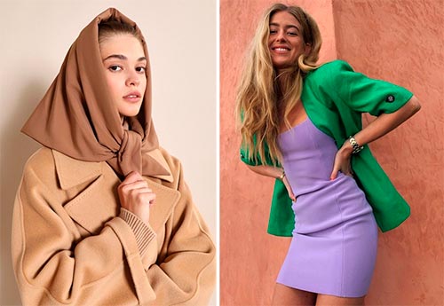
We can also easily combine neutral colors with each other and with achromats. What if you combine neutrals with bright ones? I propose a scheme that I love very much, which always works one hundred percent - Total bow in one color, combining neutral and bright colors in different shades, a very interesting and stylish stylistic technique. Also, in this scheme, we can add an achromatic color and go in increasing color - achromat - a neutral and bright color in one palette. For example, from white to lilac and purple, or from black to mint and green. So you get very prominent images that will definitely attract the eyes, and you will be presented with compliments.

Color build-up from achromat to bright: Beige, mint, bright green

Color fade from neutral to bright: Metallic, muted purple, hot pink.

Color build-up from achromat to bright: White, lilac, violet.

The increase in color from achromat to bright: White, purple, bright similar colors - purple and blue.

Color build-up from achromat to bright: Black, mint green and brighter grassy green.

Color build-up from neutral to bright: Total bows in the green palette - from neutral to bright shades.
Let's now take a look at the group that causes the most fear - these are bright colors. We call bright all saturated and contrasting colors of the rainbow.
For those who are ready to take a little risk and experiment with bright colors, I have prepared several universal schemes for combining bright colors with each other:
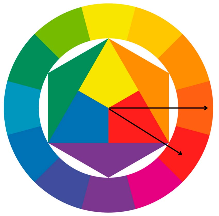
Many already know or have heard about Itten's color wheel, but if not, then now we'll figure it out together. This is a versatile tool that I suggest you use to combine two or more vibrant colors in your looks.
- Two opposite colors, such as yellow and purple, orange and blue, or green and pink.

Examples:

Color block is two opposite bright colors.

Two opposite vibrant colors.

Two opposite bright colors + achromat.
- Two similar colors located side by side in Itten's circle, such as purple and blue, yellow and green, or red and orange.
Examples:

Color block is two similar colors.

Two similar bright colors

Two similar bright colors
- Triad - three bright colors from close sectors of the circle, two similar colors and one opposite or three equally distant colors. For example, purple, pink and green, or yellow, red and blue.


Examples:

Three equally distant colors

Two similar colors and contrasting to them

Two similar colors and contrasting to them
- A tetrad - four bright colors located at an equal distance between them, or three similar ones and a fourth contrasting color to them, or from colors that are close sectors of the circle. For example, green, orange, pink and blue (equidistant), or green, light green, blue and red.


Examples:

A tetrad of four equidistant colors

A tetrad with three similar colors and one contrasting shade.

Tetrad of equidistant colors

A tetrad of colors from close sectors of the color wheel.
Since all achromats and neutrals are completely universal, we can combine with each other without hesitation, and add the relevance of the image with stylish styles and textures. But now you have schemes that will help you be on your toes with bright colors and easily integrate them into your looks. Save yourself the color wheel and experiment with pleasure.
Tell friends:
Comments and Reviews
Add a comment
Similar materials
 How to beautifully and correctly combine colors in an image?
 Bright colorful wardrobe: there are no rules, but there are recommendations
 The best color combinations in clothes for men
 What colors are combined in clothes
 Marsala color in clothes - what to combine
 5 trends of the 2021-2022 season for everyday looks
Rating news
Shades of clothing that make women look younger
What shades of hair make women younger: rules and photos
Funny wedding dresses - photos and ideas
12 most expensive down jackets for the winter
How to look 25 at 40: tips from supermodels
Beautiful schoolgirls
Anti-aging haircuts and hairstyles for women
Fashionable skirts for autumn and winter
Fashionable women's trousers for the cold season
Fashionable and stylish sandals for summer 2020
Spring-summer 2021
 Fashionable dresses and tops with thin spaghetti straps
 Bandana tops: how to wear stylishly and beautifully
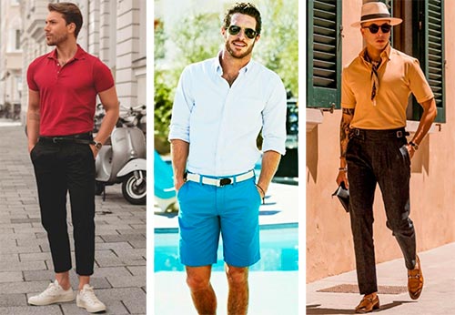 How to put together the perfect men's wardrobe for the summer
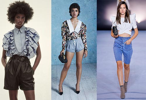 Fashionable shorts for spring-summer 2021
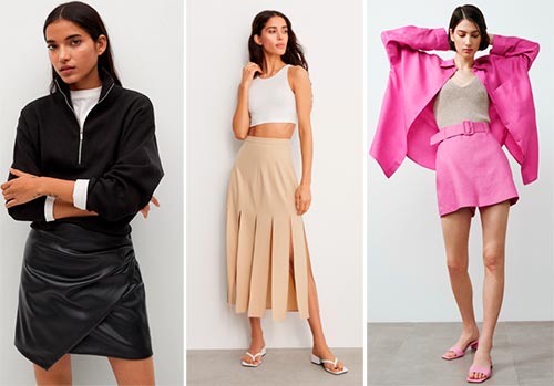 Fashionable skirts for spring-summer 2021: a guide to online shopping
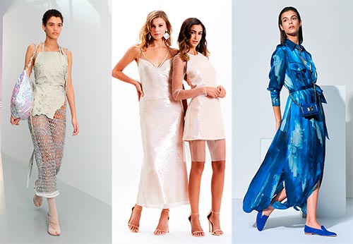 The most fashionable dresses spring-summer 2021: styles and colors
 Fashionable total look 2021: ideas of images and trends